Learning graphic design should start with visual principles — layout, hierarchy, white space, colour and type — and only then move on to software. Software is just the pen: beginners who start with Photoshop tend to produce banners packed with effects that look cluttered, break Vietnamese accents and that nobody wants to pay for. This lesson gives you the right learning order, how to choose software and a computer, a 6-month plan with concrete week counts, and a list of 8 portfolio pieces that is enough to apply for a job or take your first freelance work in Vietnam.
By the end of this lesson, you will be able to:
- Check a design against 5 principles — layout, hierarchy, white space, colour and type — and point out at least 3 specific faults.
- Choose a software set that fits your budget (paid, freemium or open source) and a computer that is good enough.
- Draw up a 6-month study plan (26 weeks, about 10 hours a week) with a clear goal for each phase.
- Check image and font licences before using them for a client, and choose fonts that display Vietnamese diacritics correctly.
- List 8 portfolio pieces and estimate reference prices for your first jobs.
Want to learn graphic design in the right order? Visual principles, layout and copyright are the first step of the roadmap. See the 8-step graphic designer roadmap to know what comes next.
Why learn the fundamentals before the software?
Clients do not pay for how many tools you know. They pay for a poster that can be read in 3 seconds, or a menu that helps customers order quickly. That comes from principles — and principles work in every program.
Layout and grids: everything needs a place
Layout is how you arrange the blocks (images, headline, body text, logo) inside the frame. Beginners tend to put each item wherever it "fits". Professionals use a grid: divide the frame into equal columns and rows, then align every block to the grid lines. For example, a 1080×1080 px square post divided into 6 columns with a 60 px margin on each side — headline, image and call-to-action button all follow the column edges, and the result looks much tidier.
Visual hierarchy: what does the eye read first?
Hierarchy means deciding which piece of information matters most and making it stand out most, using size, weight, colour and position. A grand-opening flyer should have exactly one "entry point" — usually the offer or the shop name — 2–3 times larger than the body text. A quick self-check: squint at the design from a distance; the block that appears first must be the one you want people to see first.
White space: empty space is not wasted space
White space (not necessarily white) is the empty area around and between blocks; it groups related information and separates unrelated information. When a client says "it looks too empty", do not stuff in flowers and stars — explain that white space makes the product look premium and easier to read.
Colour and Vietnamese type: where beginners go wrong most
Colour and type are the two places where an amateur shows most. Step 2 of the roadmap goes deeper; here you only need enough to avoid basic mistakes.
The colour wheel and the 60-30-10 rule
The colour wheel (see Figure 1) helps you pick colours that work together: neighbouring (analogous) colours feel calm, opposite (complementary) colours give strong contrast. The easiest rule to apply: 60% dominant colour (often the background), 30% secondary colour, 10% accent colour for a button or an offer. While you are learning, do not use more than 3 main colours in one design.
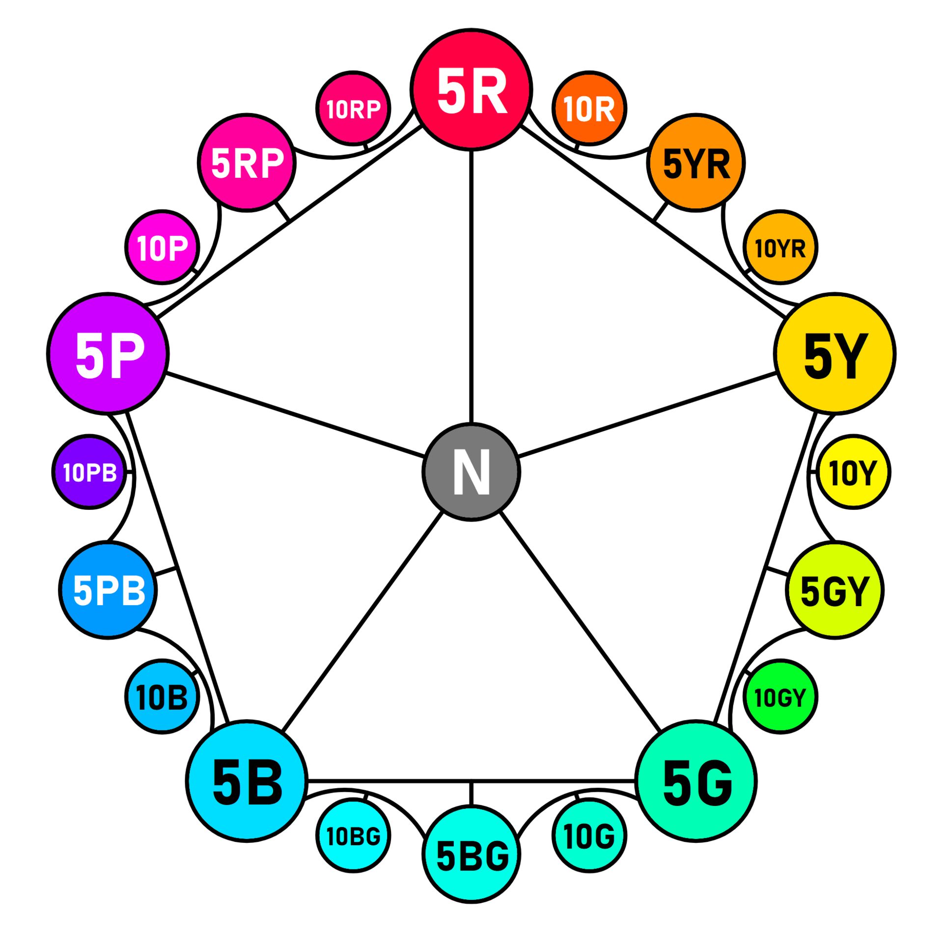
Photo: 8-leaf clover / Wikimedia Commons, CC BY-SA 4.0
Also remember: screens display RGB, printers use CMYK. A vivid green on a phone can print noticeably duller. Files for print must be converted to CMYK and proof-printed before a large run.
Vietnamese type: choose fonts with full diacritic support
Many beautiful foreign fonts lack the Vietnamese character set: letters that stack two marks, such as an "e" with a circumflex and a dot below, get swapped for a fallback font, accents shift, or marks collide. Before using any font, type a test sentence containing every stacked accent, in both upper and lower case. Google's free font library has a language filter that shows only fonts supporting Vietnamese, for example Be Vietnam Pro, Lexend and Roboto.
Vietnamese capitals easily push their accents into the line above, so for all-caps headlines increase the line spacing to about 1.2–1.3 times the font size. While learning, look at old metal type (Figure 2) to see that each typeface has its own character: serifs, weight and width.
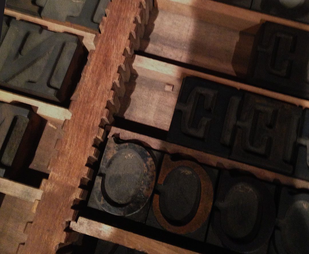
Photo: Nol-ellis / Wikimedia Commons, CC BY-SA 4.0
Pair two fonts at most
One font for headlines and one for body text is enough for a design. A safe pairing: a serif or bold, characterful headline font with an easy-to-read sans-serif for body text. Use weights (Regular, Bold) and sizes to build hierarchy; you do not need a third font.
Choosing design software: paid, free or open source?
There is no "right" program for beginners, only a toolset that fits your budget and the kind of work you want to do. The table compares four common options in Vietnam in 2026.
| Option | Used for | Cost (2026 reference) | Strengths | Limits |
|---|---|---|---|---|
| Photoshop + Illustrator | Photo editing, compositing, vectors, logos, print files | Monthly or yearly subscription, depending on plan and student discounts; check the official site | The standard at agencies and print shops, often required in job ads | Ongoing cost, needs a decent computer |
| Figma | Web and app interfaces, social posts, teamwork | Limited free plan; paid plans per user | Runs in the browser, live collaboration with clients | Weak at photo editing, not built for print files |
| Canva | Quick posts, slides, simple materials | Free version; paid Pro version | Very fast, many templates | Designs easily look "template-like", limited customisation; read the terms for templates and assets |
| Krita / Inkscape / GIMP | Digital painting (Krita), vectors (Inkscape), photo editing (GIMP) | Free, open source | Fully legal, enough to learn the principles and build a portfolio | Interface differs from Adobe; few print shops are used to the native files |
Which toolset at which stage
Months 1–2: paper, pencil and one free program to learn the principles. Months 3–4: Photoshop and Illustrator (if you are aiming for an agency) or GIMP and Inkscape (on a tight budget); layer, mask and pen-tool skills transfer between them. Canva is a side tool, not where you learn the trade. Learning in a group, as in software workshops (Figure 3), gives you people to critique your work.
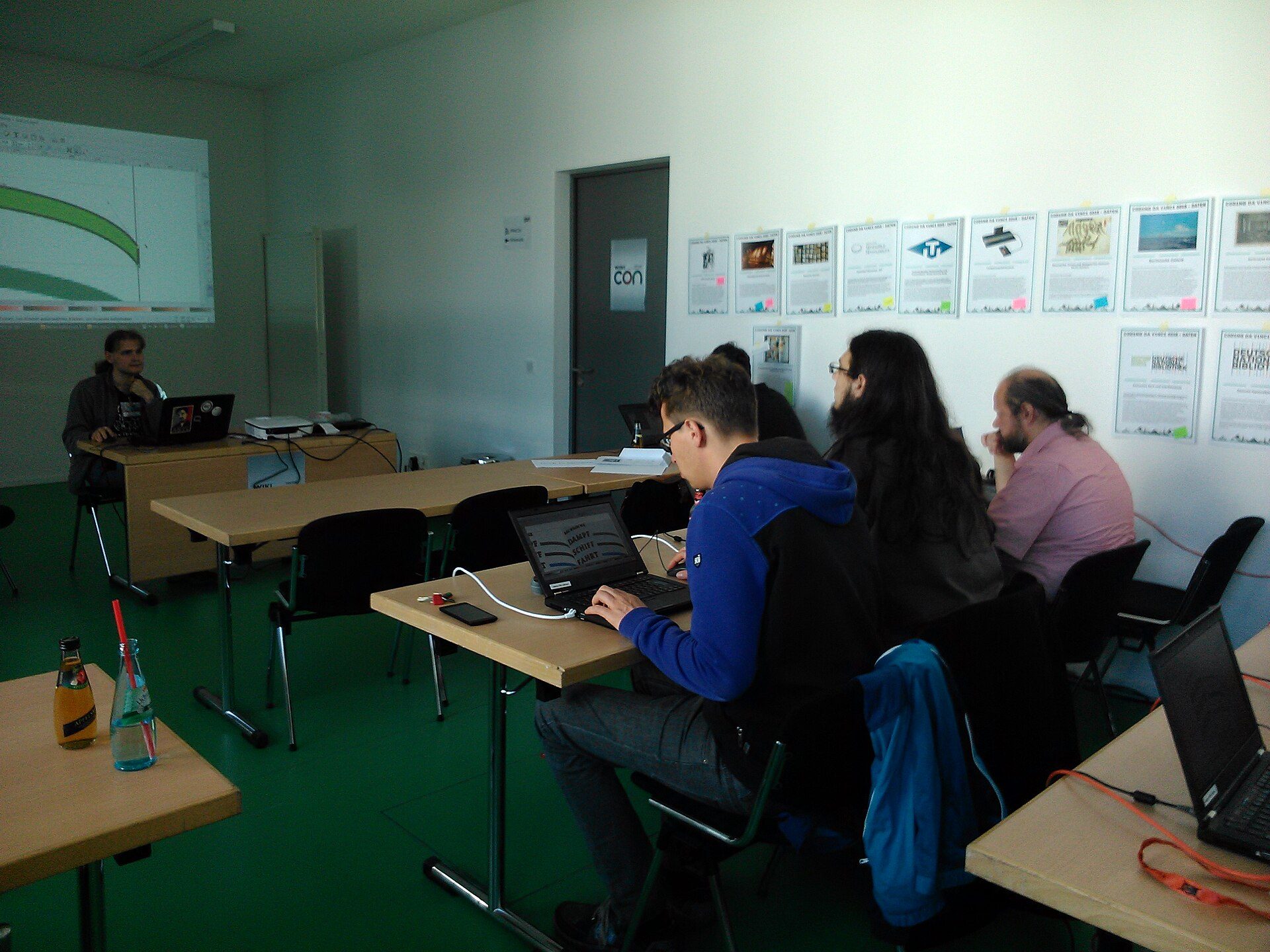
Photo: BigDaddy73 / Wikimedia Commons, CC BY-SA 4.0
Do not use cracked software
Cracked copies can carry malware that steals banking and social media accounts — exactly the accounts you use to get paid by clients. Using unlicensed software for commercial work also breaks intellectual property law in Vietnam. If you cannot afford a subscription yet, use free or open-source programs: employers judge your work, not the software logo.
Computer and equipment: what is enough?
You do not need the most expensive machine; you need one that runs smoothly, a screen with accurate colour and somewhere to back up files. An 8 GB RAM machine can still be used for learning, but it is slow with large print files.
Reference specification
| Part | Minimum for learning | Recommended once you take paid work |
|---|---|---|
| CPU | Core i5 / Ryzen 5 or an early Apple M-series chip | A newer generation with more cores |
| RAM | 8 GB (works, a bit slow in Photoshop) | 16 GB or more |
| Storage | 256 GB SSD | 512 GB SSD plus an external drive or cloud backup |
| Screen | IPS panel, Full HD | About 100% sRGB coverage, can be calibrated |
| Pen tablet | Not needed yet, a mouse is fine | A basic tablet for illustration and heavy retouching |
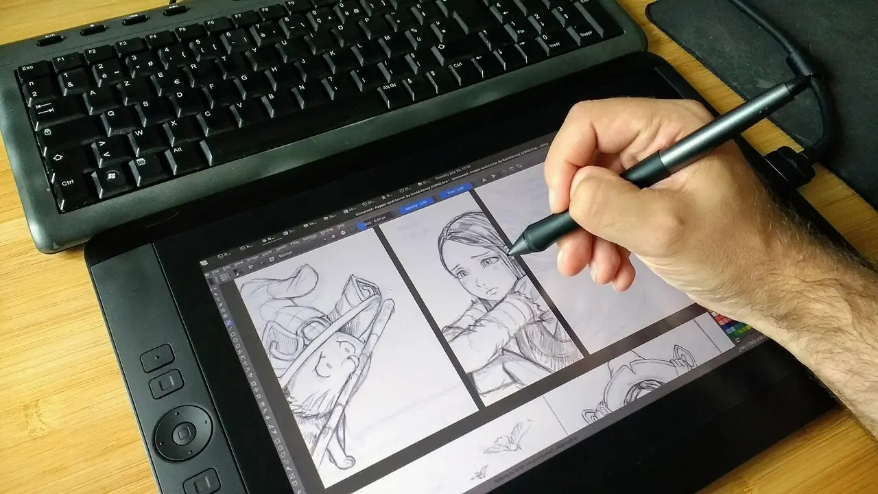
A laptop at the "recommended" level costs roughly 15–25 million VND in 2026 (about 600–1,000 USD), depending on brand and whether it is new or used. A basic pen tablet (Figure 4) is about 1–3 million VND; pen displays like the one in the cover photo cost several times more and are only needed if you specialise in illustration.
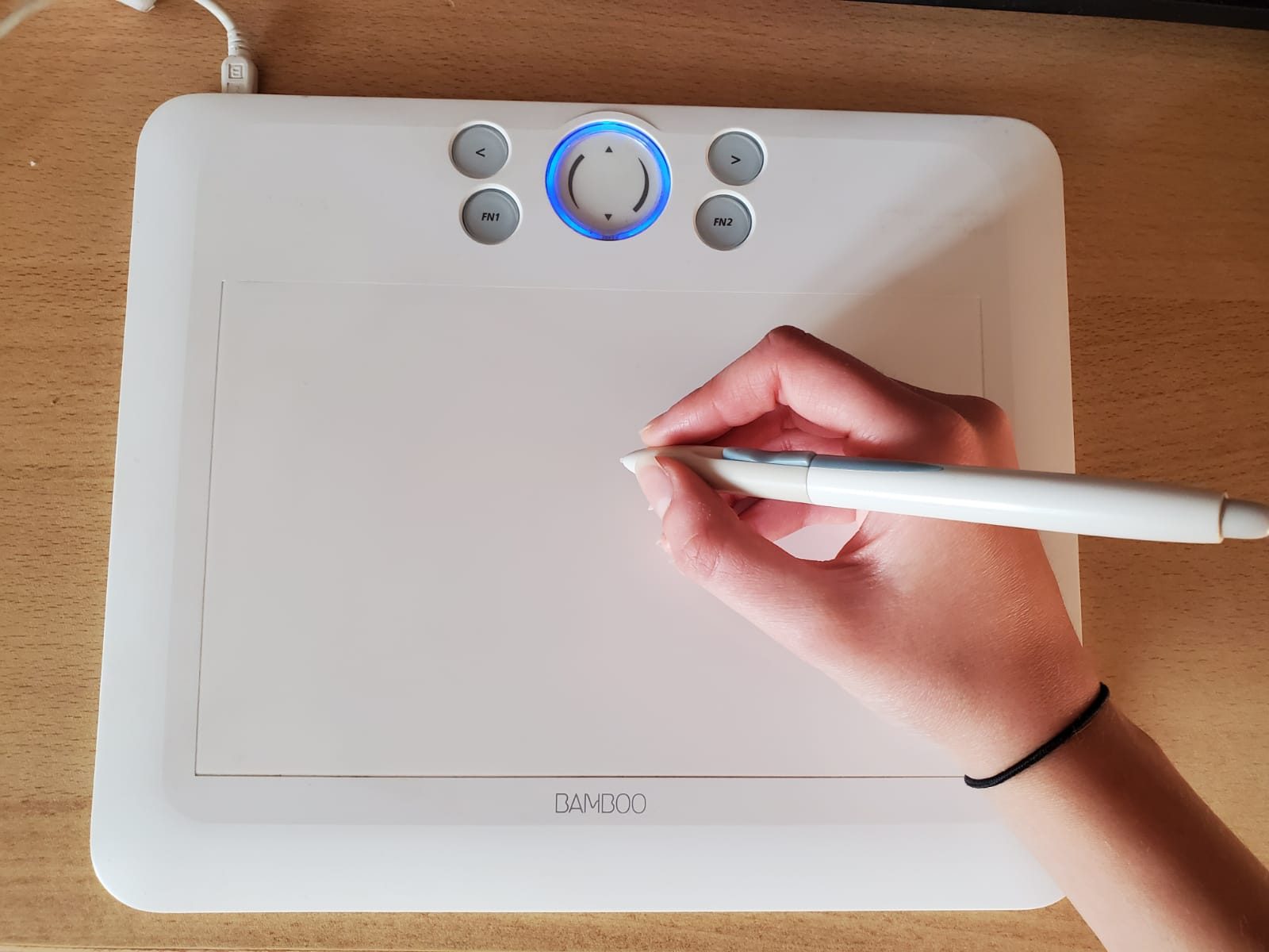
Photo: Piknuz / Wikimedia Commons, CC BY-SA 4.0
Posture and eyes during long sessions
Health warning: designers often sit for 6–10 hours a day. Put the top edge of the screen at eye level, about an arm's length away; every 20 minutes look at something about 6 m away for 20 seconds; stand up and move every hour. If wrist pain, numb fingers or blurred vision persist, see a doctor rather than putting up with it. On the legal side: only use images, fonts and templates with the right licence — if copyright is breached, your client is the one who receives the complaint first.
A 6-month self-study plan for graphic design
The plan below is designed for someone with a day job studying about 10 hours a week. Six months is about 26 weeks; you can stretch it if you are busy, but do not change the order.
| Phase | Weeks | What to learn | Output at the end of the phase |
|---|---|---|---|
| 1. Visual principles, hand sketching | 4 | Layout, grids, hierarchy, white space; copy 20 good designs in pencil | Analysis of 10 posters, pointing out faults and strengths |
| 2. Colour and Vietnamese type | 4 | Colour wheel, 60-30-10, RGB vs CMYK; choosing and pairing fonts with diacritic support | Palette and font pair for 3 imaginary brands |
| 3. Photo editing (Photoshop or GIMP) | 5 | Layers, masks, cut-outs, colour correction, product compositing | 3 product photos cut out and placed in a scene |
| 4. Vectors (Illustrator or Inkscape) | 5 | Pen tool, shape combining, icons, a simple logo, SVG/PDF export | 1 logo plus a set of 6 icons |
| 5. Social media and print | 4 | Post and banner sizes; print files in CMYK, 3 mm bleed, 300 dpi | 1 poster, 1 flyer, 1 business card proof-printed |
| 6. Portfolio and design test | 4 | Finish 8 pieces, write descriptions, take a 4-hour brief-based test | Online portfolio plus a price list |
| Total | 26 weeks | About 26 × 10 = 260 hours of study and practice | |
Check: 4 + 4 + 5 + 5 + 4 + 4 = 26 weeks, about 6 months. The two software phases are longer because they need more hands-on practice, but phases 1–2 are what decide whether your work looks good.
A sample 10-hour week
- Tuesday, Thursday and Saturday evenings: 2 hours each — 30 minutes of theory, 90 minutes of practice.
- Sunday: 4 hours to finish one complete piece and post it for feedback from your study group.
- Total: 3 × 2 + 4 = 10 hours.
Copying good designs in phase 1 is for practice only: do not publish them as your own work and do not sell them.
Image and font copyright: clients get sued because designers were careless
One image grabbed at random from the internet can get a client's advert taken down or lead to a compensation claim. The publisher — your client — is held responsible first, and they will not hire you again.
Images: only from sources with a clear licence
- Photos you took yourself, or photos supplied by the client (ask whether they actually hold the rights).
- Free stock sites whose licence clearly allows commercial use; read each site's terms, because they differ.
- Wikimedia Commons images under CC0, CC BY or CC BY-SA — CC BY and CC BY-SA require you to credit the author and licence.
- Paid stock libraries when you need high-quality images with models and a clear licence.
Fonts: "free for personal use" is not for clients
Many fonts online say "free for personal use" — meaning they cannot be used for a client's logo, adverts or packaging. Fonts under the SIL Open Font License (most of the fonts in Google's free library) allow commercial use. Save the licence link for every font and image in the project folder; at hand-over, give the client a list of the assets used.
Templates, AI and assets in Canva and Figma
Ready-made templates and AI-generated images have their own terms, which often forbid using them as a logo or registering them as a trademark. A logo you deliver must be drawn by you; terms change over time, so always check the platform's current terms page.
An 8-piece portfolio and reference prices for paid work
Employers and individual clients look at a portfolio for 1–2 minutes. Eight good pieces covering different kinds of work, each with a short story, are more convincing than 40 scattered exercises.
The 8 pieces to include
- Logo, palette and font pair for a small shop (imaginary or real).
- A set of 3 social media posts in a consistent style for the same shop.
- An A3 event poster, print-ready in CMYK with 3 mm bleed.
- A folded flyer or a single-sided menu.
- A double-sided business card (90 × 54 mm), proof-printed.
- A product photo cut out and composited into a scene for an e-commerce marketplace.
- A set of 6 vector icons with a consistent stroke.
- One advert banner in 3 sizes (square, vertical 9:16, horizontal) — proof that you can adapt a layout.
Add 3–4 lines to each piece: the client's problem, how you solved it, and the sources of images and fonts. Publish on a personal portfolio site or a portfolio platform such as Behance.
Reference salaries and freelance rates
| Job or position | 2026 reference |
|---|---|
| Junior designer (monthly salary) | 7–10 million VND |
| Experienced designer or independent projects (monthly income) | 15–30 million VND |
| Social media post (each) | 150,000–500,000 VND |
| Single-sided poster or flyer | 300,000–1,500,000 VND |
| Double-sided business card | 200,000–600,000 VND |
| Logo for a small shop (2–3 concepts, 2 revision rounds) | 1,500,000–8,000,000 VND |
These are 2026 reference figures for Vietnam, varying by region, platform and experience; they are not an income guarantee. When freelancing, state the number of revision rounds and the delivery deadline, and check your personal income tax obligations with the current guidance from the Vietnamese tax authority.
Worked example: Hoa, 24, studying in the evenings for 6 months
Hoa works as a sales assistant, has an old laptop with 8 GB of RAM and wants to become a designer. She has 10 hours a week and a budget of under 3 million VND for the whole self-study period.
Six-month costs
| Item | Reference cost |
|---|---|
| Upgrade the laptop to 16 GB RAM | 900,000 VND |
| Basic pen tablet (bought in month 3) | 1,200,000 VND |
| Proof prints of poster, flyer and business card for the portfolio | 300,000 VND |
| Software: Inkscape, GIMP, Krita, Figma free plan | 0 VND |
| Total | 2,400,000 VND (about 95 USD) |
Check: 900,000 + 1,200,000 + 300,000 + 0 = 2,400,000 VND, under the 3 million budget. When an agency asks for Photoshop, she uses the official trial to transfer her layer and mask skills from GIMP.
Results after 26 weeks
She finishes the 8 pieces on the list above, including an identity kit for a sweet-soup shop owned by an acquaintance that is actually in use. She lands her first 2 small jobs: 6 posts × 200,000 VND = 1,200,000 VND and a single-sided menu for 800,000 VND, a total of 2,000,000 VND — almost enough to cover what she spent on learning.
Common mistakes when starting out in design
Memorising tools and skipping principles
Symptom: you know 50 effects but your designs look messy. Cause: jumping into software in week one. Fix: go back to phase 1, analyse 10 good designs and rework 3 of your old pieces on a grid.
Vietnamese text breaking when sent to the client
Symptom: it looks fine on your computer, but the client sees boxes or misplaced accents. Cause: the font does not support Vietnamese, or the client does not have the font. Fix: only use fonts you have tested with every accent; when sending print files, convert text to outlines or export a PDF with embedded fonts.
Taking images from the internet "because everyone does"
Symptom: the client receives a complaint and the advert is taken down. Cause: the licence was never checked. Fix: record the source and licence of every image; if you are not sure, do not use it.
Frequently asked questions
Can I learn graphic design if I cannot draw?
Yes. Most of a designer's work is arranging type, images and shapes according to principles, not painting pictures. Drawing helps you sketch ideas quickly, and it improves gradually during phase 1.
Should I learn Photoshop or Canva first?
Learn the principles first, then one "real" program (Photoshop/Illustrator or GIMP/Inkscape). Canva is handy for quick jobs but does not teach you layers, masks, vectors and print files — the things employers will test.
How long does it take to become employable by self-study?
At about 10 hours a week, many people have a portfolio good enough for a junior designer role after about 6 months. Studying less takes longer; what matters is the quality of the 8 pieces, not the number of months.
Can I use a free font downloaded from the internet for a client's logo?
Only if the font's licence allows commercial use (for example the SIL Open Font License). Fonts marked "personal use" do not. Keep the licence link as proof if needed.
Practice exercises and self-assessment
- Pick 5 posters or posts you see around you, redraw their layout as rectangles and note: where the entry point is, how many grid columns, and what share each colour takes.
- Type the accent test sentence in 5 fonts you like; keep only the fonts that display both upper and lower case correctly.
- Make one 1080 × 1080 px square post for an imaginary shop on a 6-column grid, with at most 2 fonts and 3 colours.
- Draw up your own 26-week study plan, with hours per week and the output of each phase.
Self-assessment criteria
- Pass: squinting at your post shows exactly one entry point; every block sits on the grid; no Vietnamese accent is misplaced or replaced by a fallback font.
- Pass: your study plan adds up to 26 weeks; every image and font in your work has its source and licence recorded.
- Not yet: more than 2 fonts or 3 main colours, images with unknown sources, or cracked software.
Once you are confident with visual principles, layout and copyright, you are ready for the next step of the roadmap: Colour and Vietnamese typography — colour schemes, RGB vs CMYK and pairing fonts for accented text. See the 8-step graphic designer roadmap to learn in the right order from principles to portfolio.